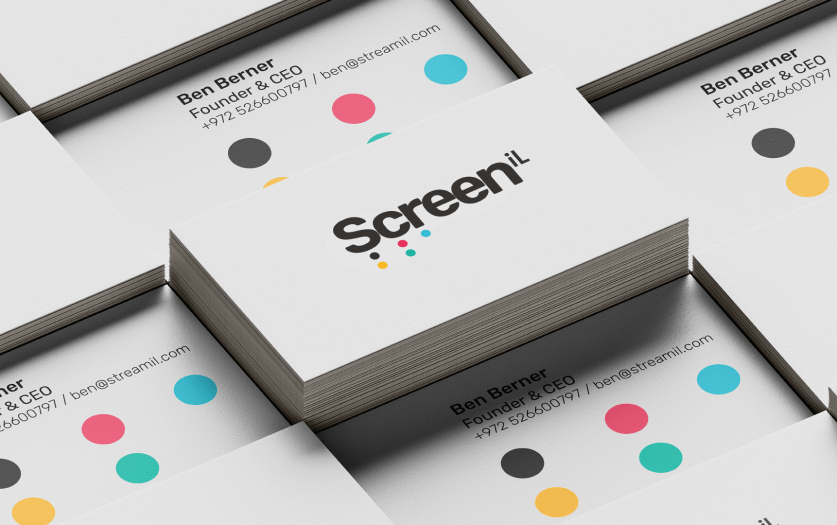
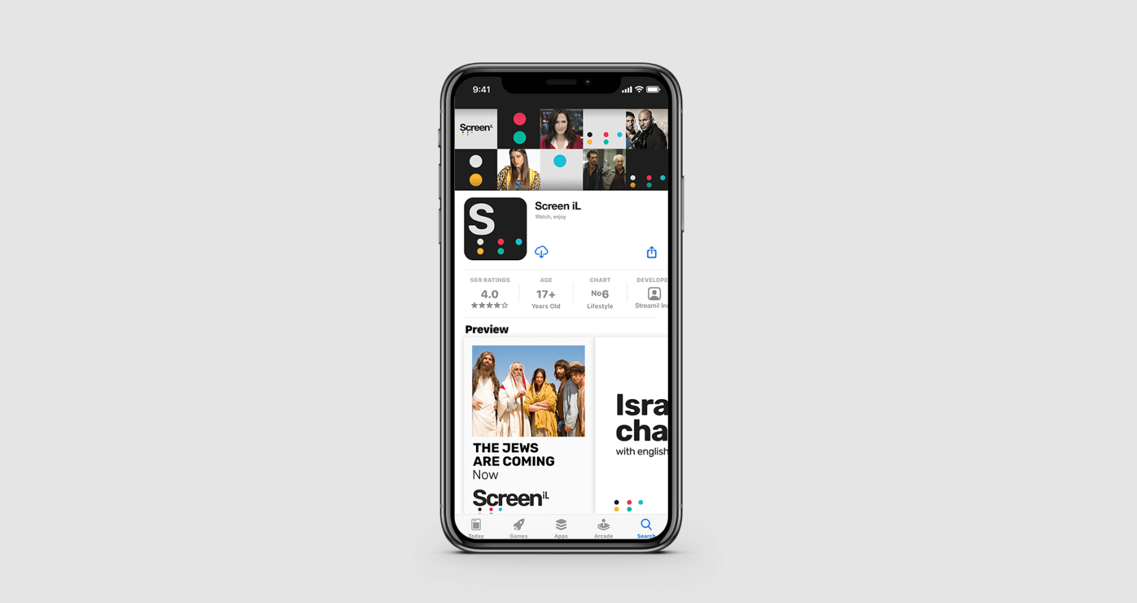
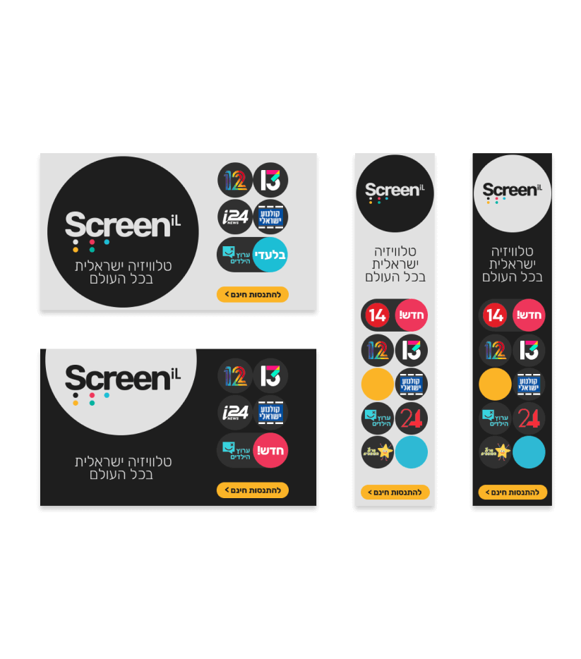
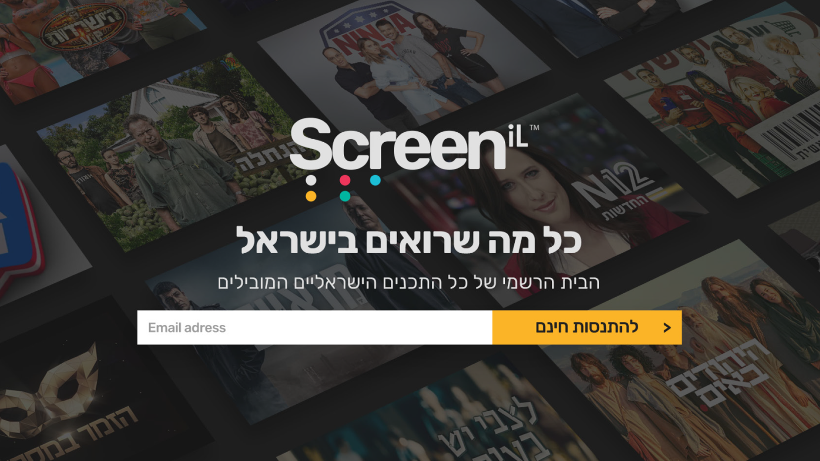
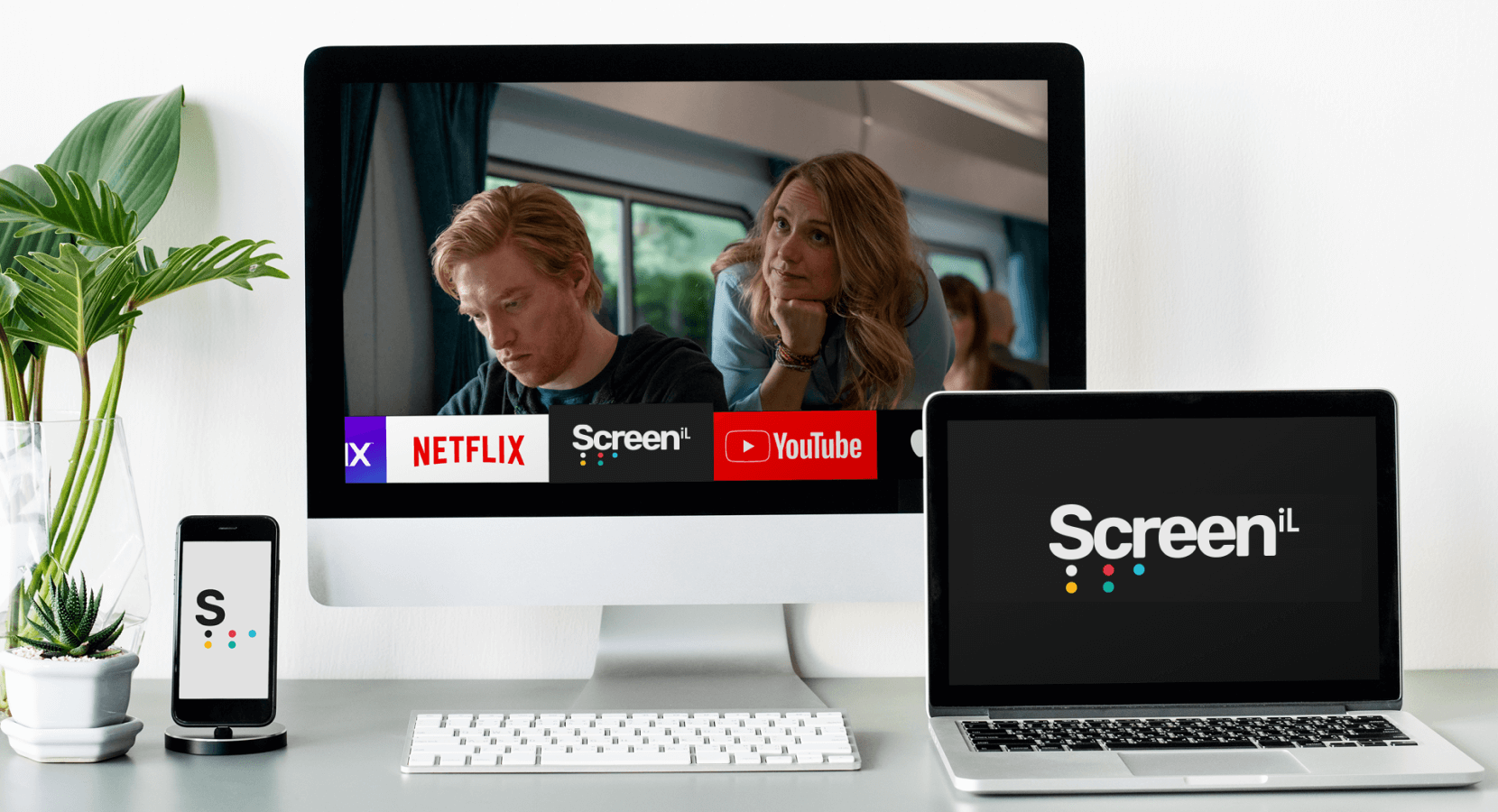
Screen IL is the first streaming company intended for Israelis living abroad. We designed the company’s brand strategy, identity, and comprehensive visual language.
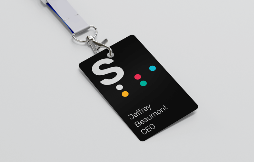
Logo White on Black
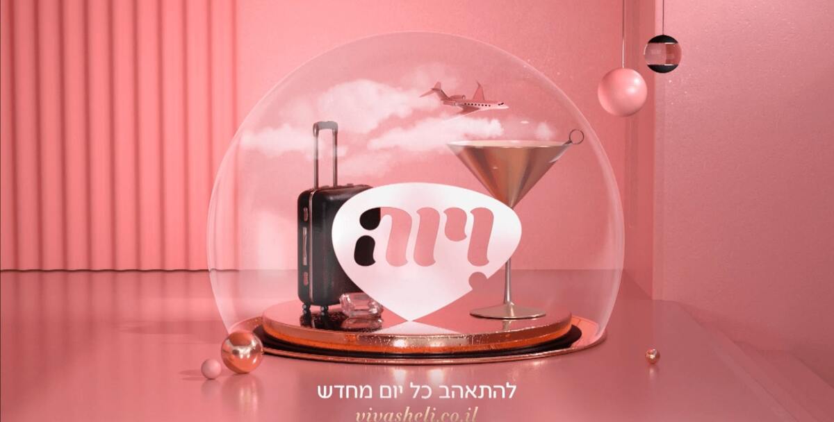
The challenge was designing a brand identity with a wide international reach while maintaining a local, Israeli touch. The big breakthrough was the logo.
We combined two elements - the name and the Hebrew Niqqud - used to represent vowels. It preserves the way the words are pronounced and is immediately recognized among Israelis.
Screenil32 2 1 1
Screenil32 1 1 1
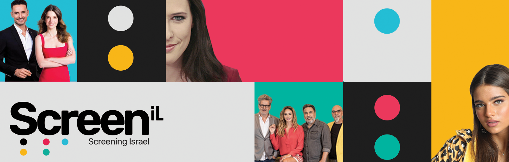
Collage Images
Screenil29 1 1
The Niqqud constitutes the uniqueness of the brand, which symbolizes the very specific target audience as the element connecting all other elements of the language