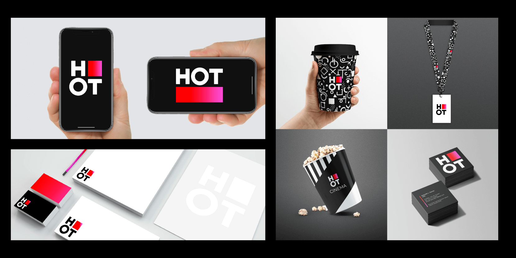
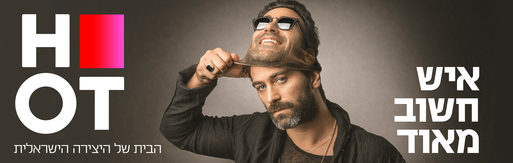
We were thrilled when we were asked to rebrand Hot, which is the largest telecommunications company in Israel. The rebranding involved changing the company logo, the graphic packaging for the parent company, and all its home channels, as well as updating the digital language and the visibility of all physical assets. The challenge was to create a fresh and dynamic look that reflects the diverse range of advanced solutions offered by the company while maintaining a consistent brand language across all marketing channels of the platform - no mean feat for such a large company.
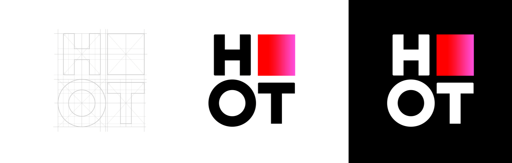
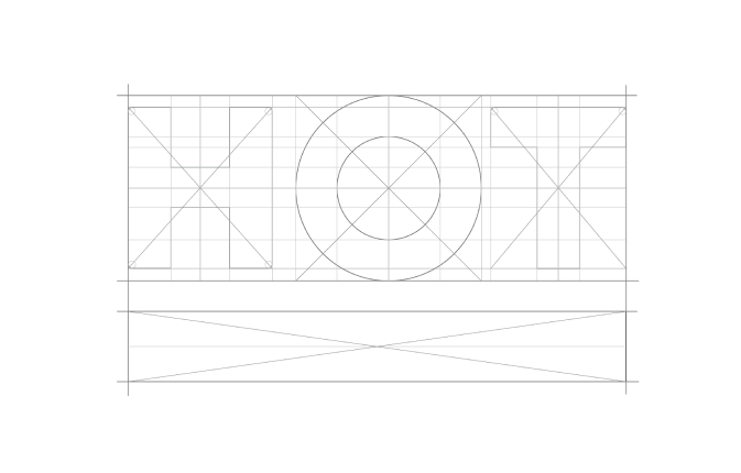
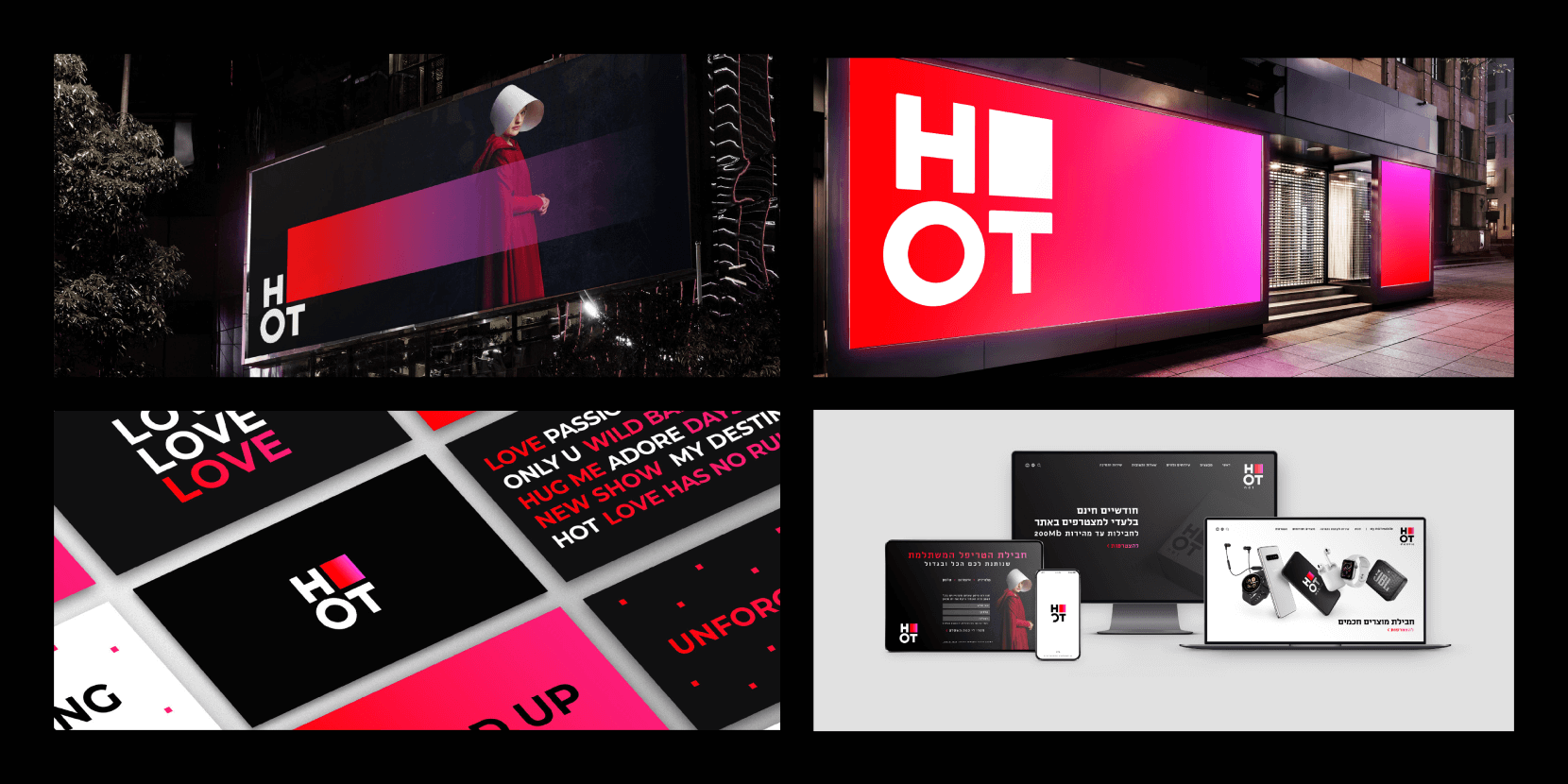
The concept of the new HOT logo is clear and confident.
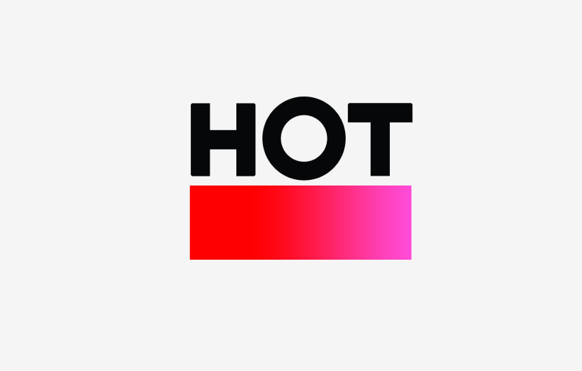
The logo serves as a visual manifestation of the company's strength, stability, and accessibility. It has two components: the gradient rectangle and the logo typeface.
hot 1 1
The logo bounces off a gradient.
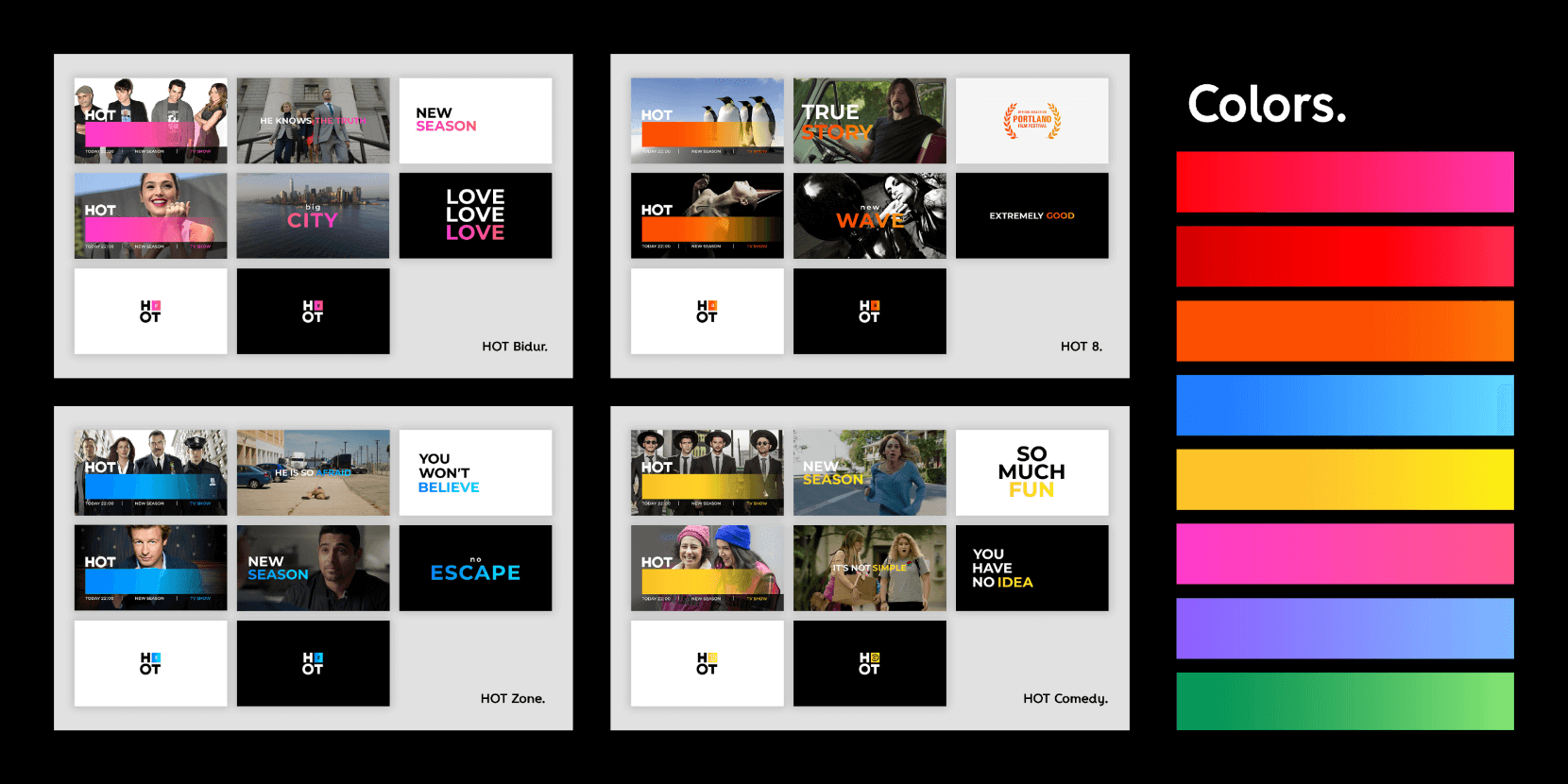
The primary color palette consists of black, white, red, and pink.
The red and pink gradient visually connects to the logo, exhibiting the brand.
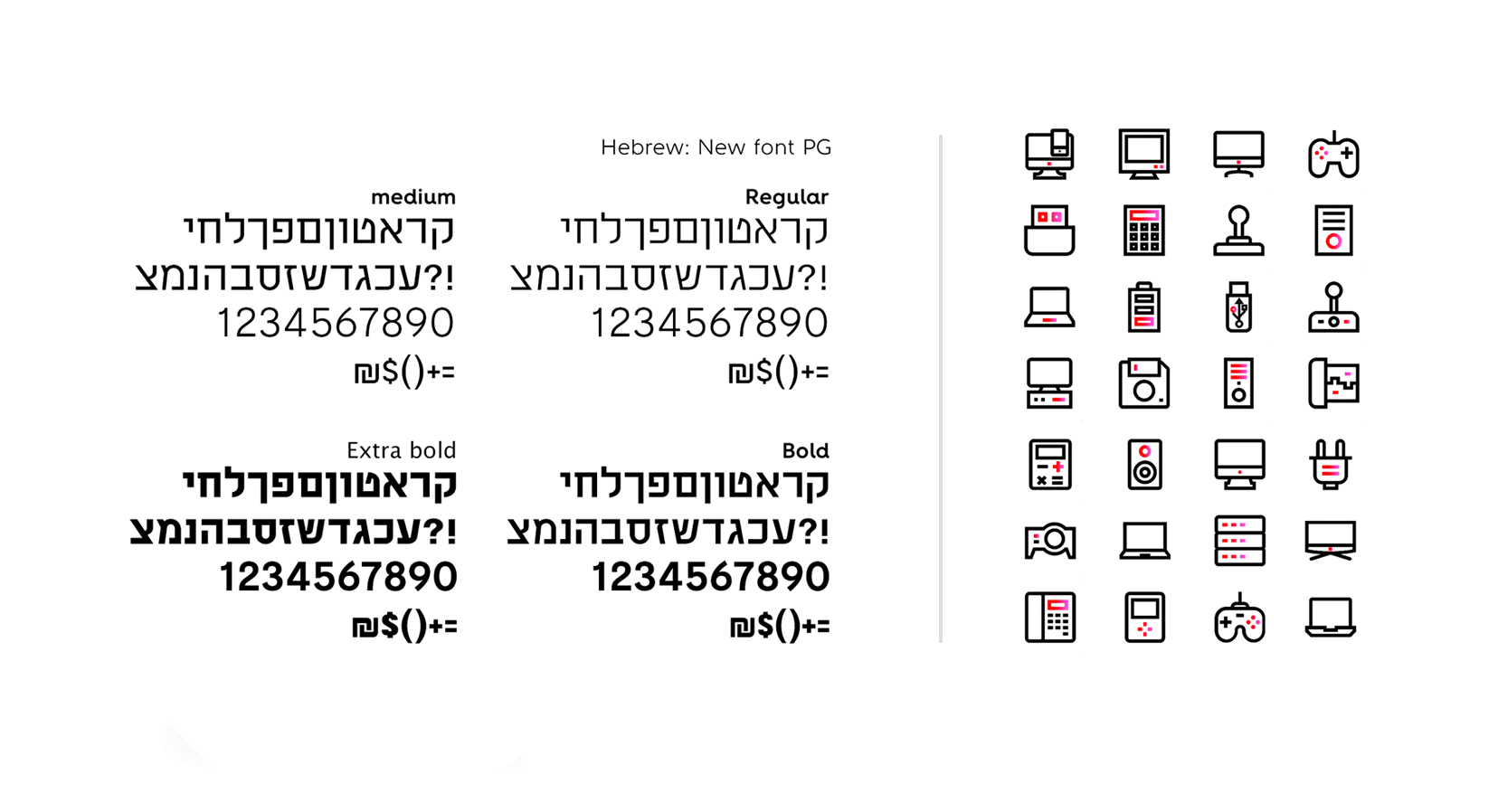
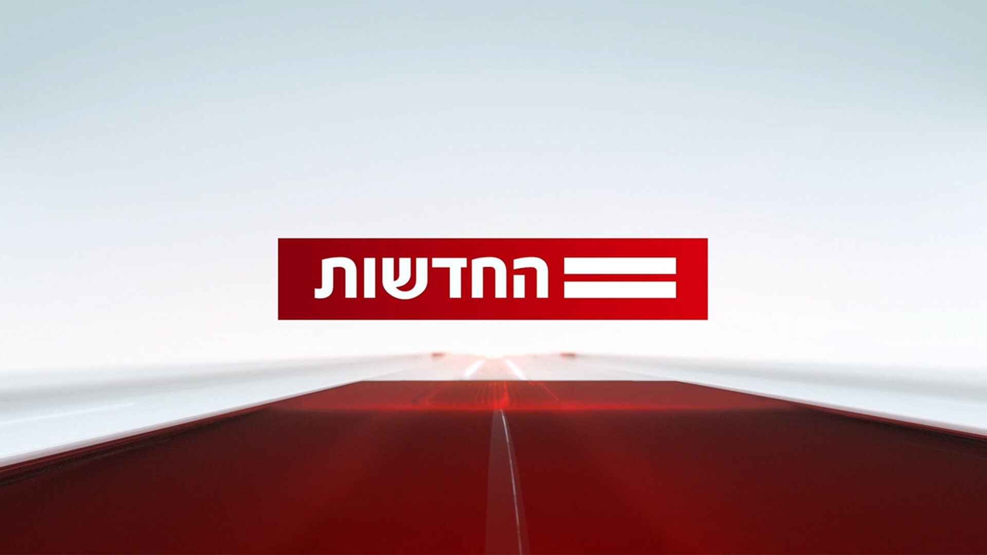
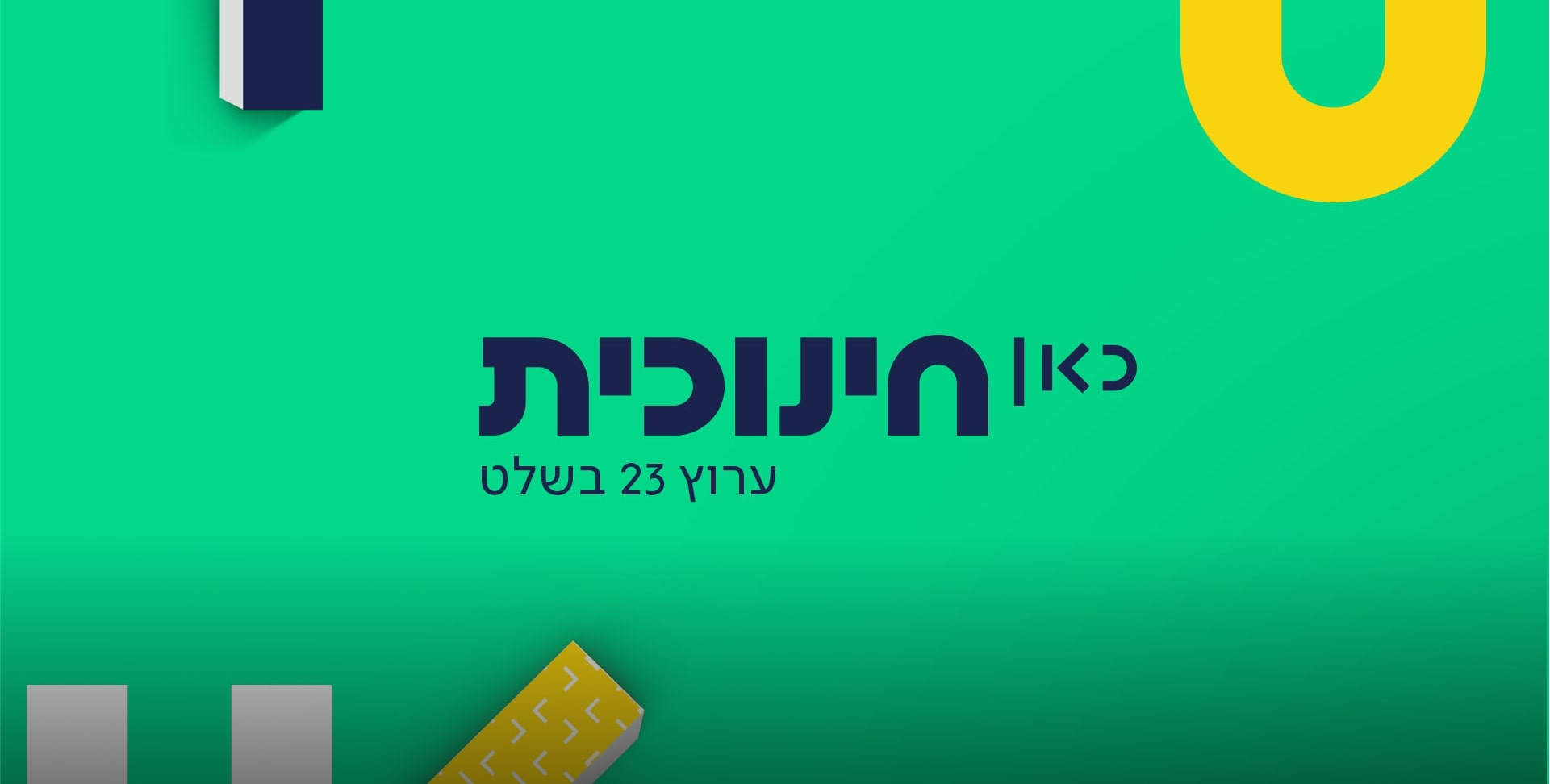
To complement the brand's values, we created clean, simple icons to hold enough detail to convey the meaning.
Hot2 11
Hot15 1
Mask group
Hot6 21 1
All channels have a wide spectrum of colors and gradients, which are all based on the gradient - each perfectly representing the unique mood and meaning.
hot 2 1
Our design approach enables flexibility and creative freedom, or, in other words, enough room for play. Yet, we ensured that it is grounded in the consistent expression of the brand.