Hot Brand Hero v4
Hot Rebranding
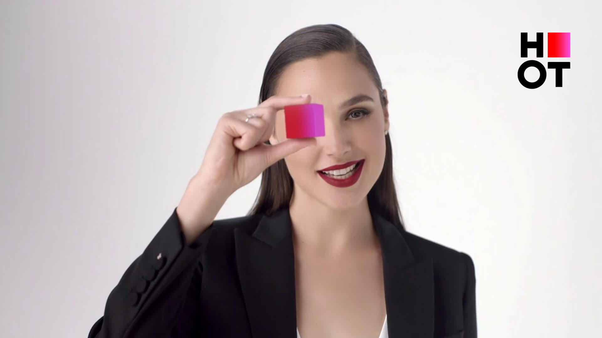
The concept of the new HOT logo is clear and confident. The logo serves as a visual manifestation of the company's strength, stability, and accessibility. It has two components: the…
The concept of the new HOT logo is clear and confident. The logo serves as a visual manifestation of the company's strength, stability, and accessibility. It has two components: the…
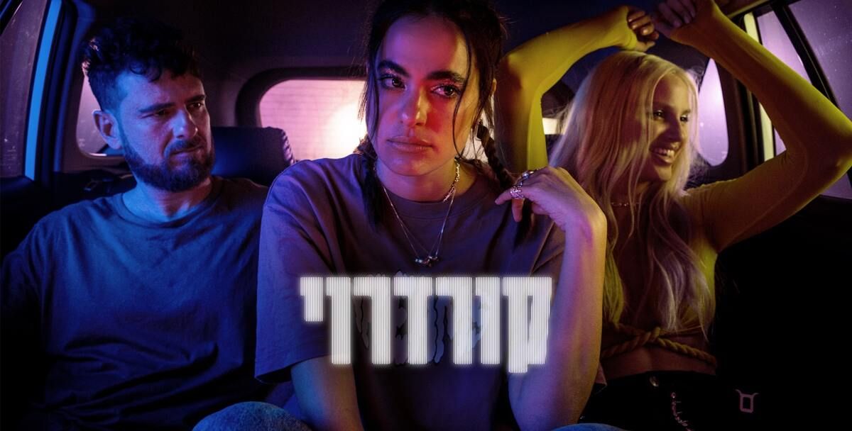
As a key image for the series, we chose to capture a photograph of the three characters inside a car, driving together. This image symbolizes the journey undertaken by Daniel,…
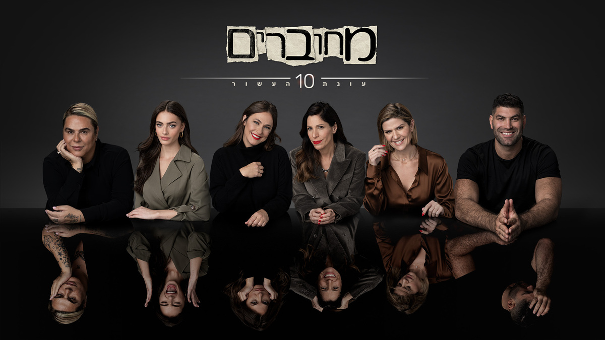
In promoting it, our task is to present the participants of the new season and to show the audience that they're going to see completely different sides of these figures…

The campaign was composed of teasers and a promo that focused on Chanshi’s funny, wacky personality and the liberating journey she goes through - while hinting that something in her…
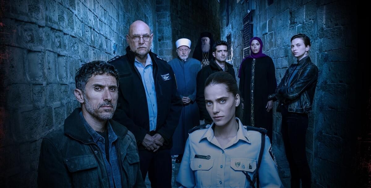
Our concept for promoting the season was to highlight the contrast between the ultra-orthodox world and the secular, urban, modern world. We wanted to make four Yeshiva guys into icons…
We created promos that illustrate the loaded atmosphere of the city and the series, a sense that at any given moment something terrible might happen, and that an explosion is…
Our objective was to create an innovative and immersive viewing experience without having to use 3D glasses or any other old-fashioned extras. Mask group 9 (1) Mask group 15 (1)…

It was a privilege and fun for us to animate the series that we grew up on and that our children are growing up on today. We began with static…

The challenge was to show how 5G seamlessly fits into HOT’s services and products and stands as a premium and advanced offering. The video needed to speak for itself. We…
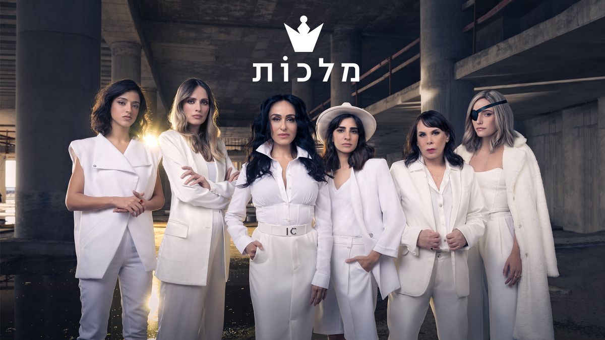
In promoting the second season of the successful show we wanted to convey the message that the "queens" never stop getting into trouble. That the events of the first season…