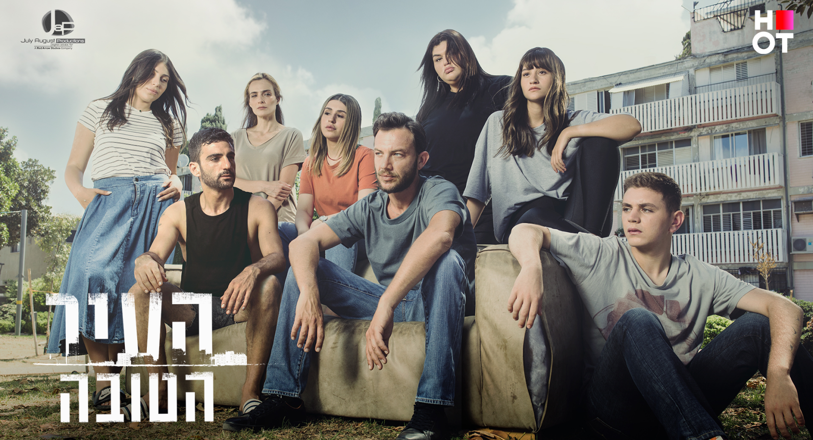
The Good Town is a roughhewn, realistic drama series that tells the story of a teacher in an outlying town, deeply involved in his students’ lives, and willing to go a great distance to help them leave the lives of hardship they face. The teacher also copes with his sexual identity in an environment intolerant of people with gay tendencies. To create a change, he decides to become politically involved and run for mayor.
In promoting the show we decided to focus on conflicts concerning the main character, emphasizing the emotion and even moments of humor in a rough and ragged environment - to present it with feeling and highlight the human aspects of the characters in the series and their struggle for human recognition in a rough environment that leaves no space to grow for those populating it.
For the series' key image we took a photo of the actors sitting on a tattered couch in the park with the backwater town in the background, a kind of meeting-place for kids.
The tough city is behind them and they're looking forward. This illustrates their desire to go elsewhere and leave the city behind, but the city is closing in on them, they can't avoid it. Some of them look at the teacher - will he be able to help them?
Mask group 2023 03 06T214724.252
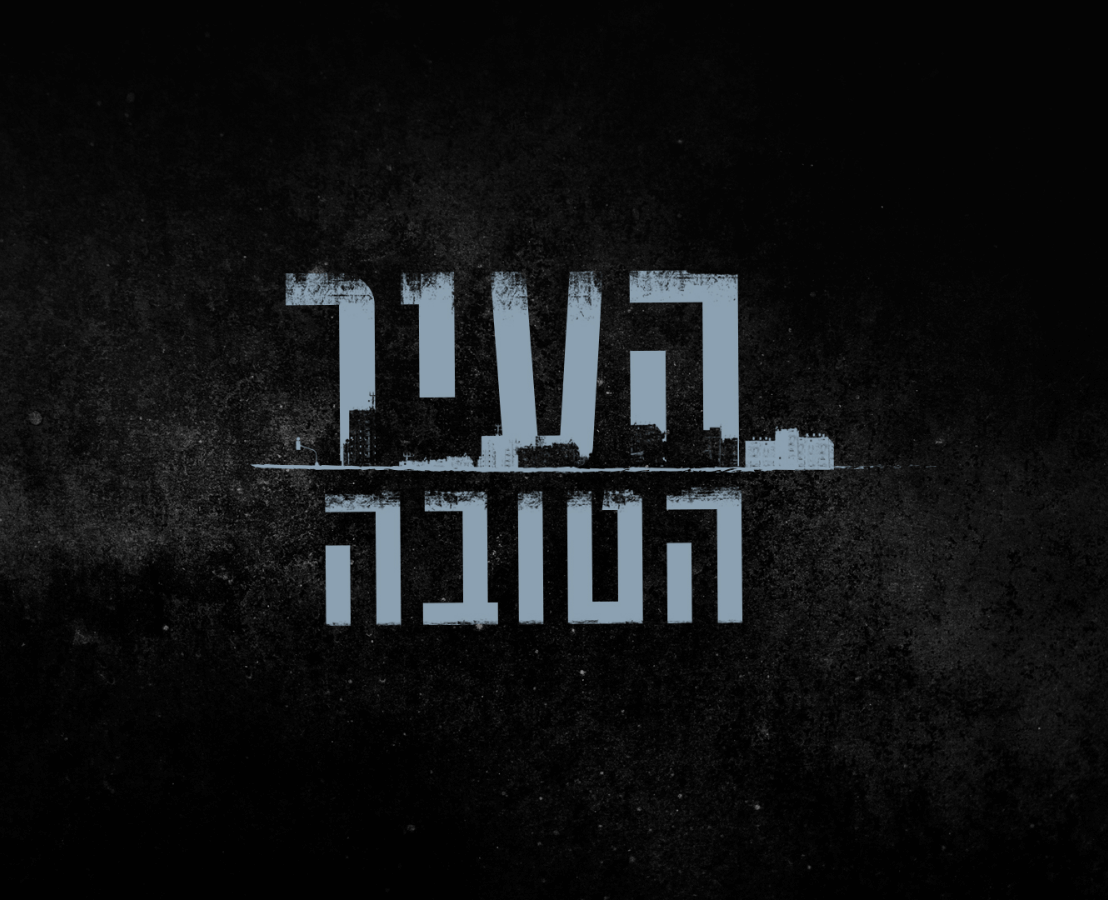
The logo also shows the contrast between the name of the series and the reality it portrays. The name is optimistic but the logo is rough and it's obvious that the town isn't actually "good."